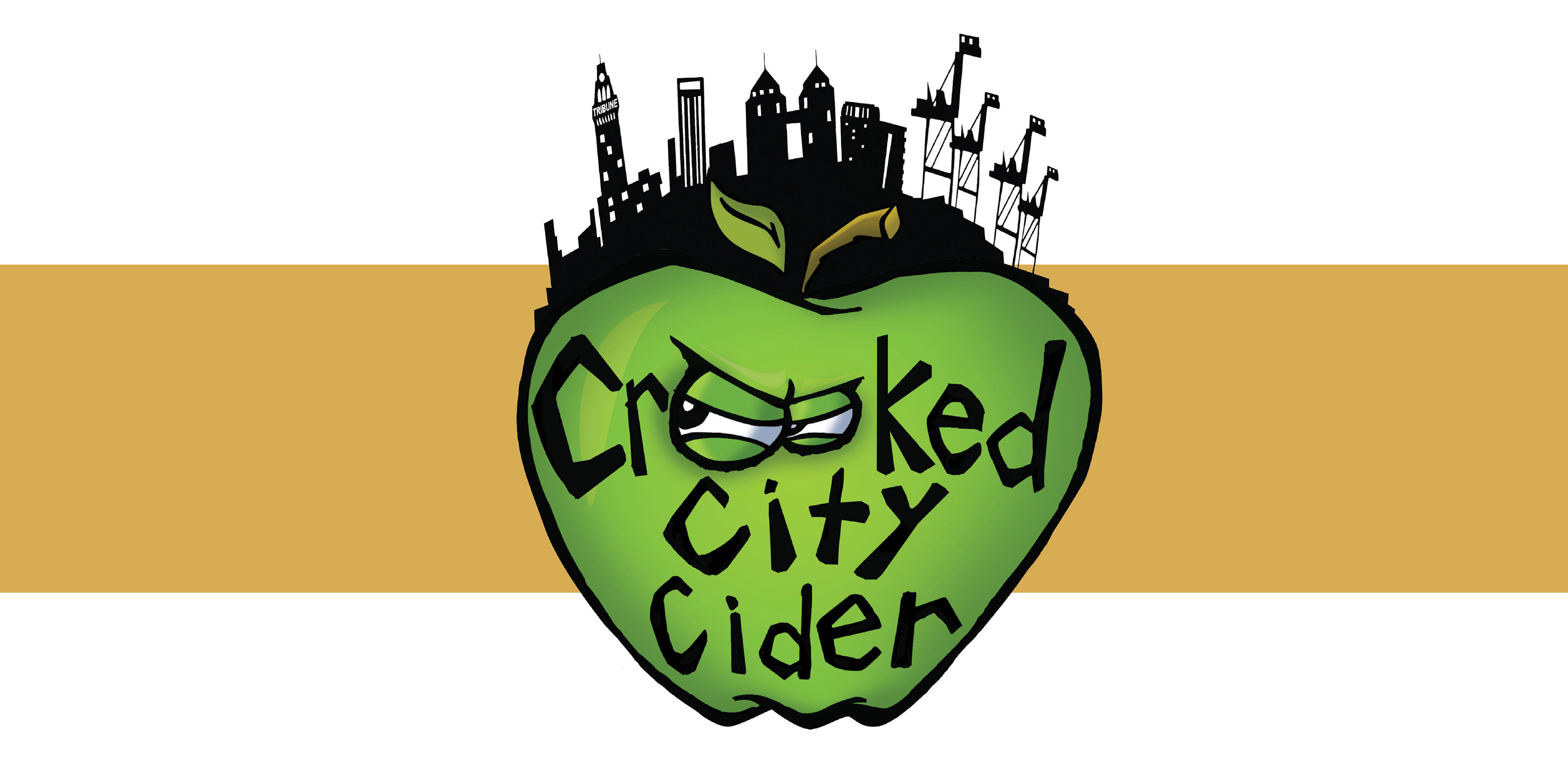
Crooked City Cider logo design
In the 1930’s the Bushouse brothers (John and Peter) were producing moonshine in the days of Prohibition. Keeping it in the family (and this time the legal way) Dana Bushouse, great-niece of the brothers started Crooked City Cider out of her basement. Located and created in Oakland, CA the cider is the towns’ first of its kind. It contains no artificial flavors or added sugars, and is available at select bars and restaurants in Oakland, as well as a shared tasting room in Uptown.
Dana wanted Oakland to be a part of the logo as much as apples are to the cider, as can be seen with the signature cranes in the city skyline.
Directions explored
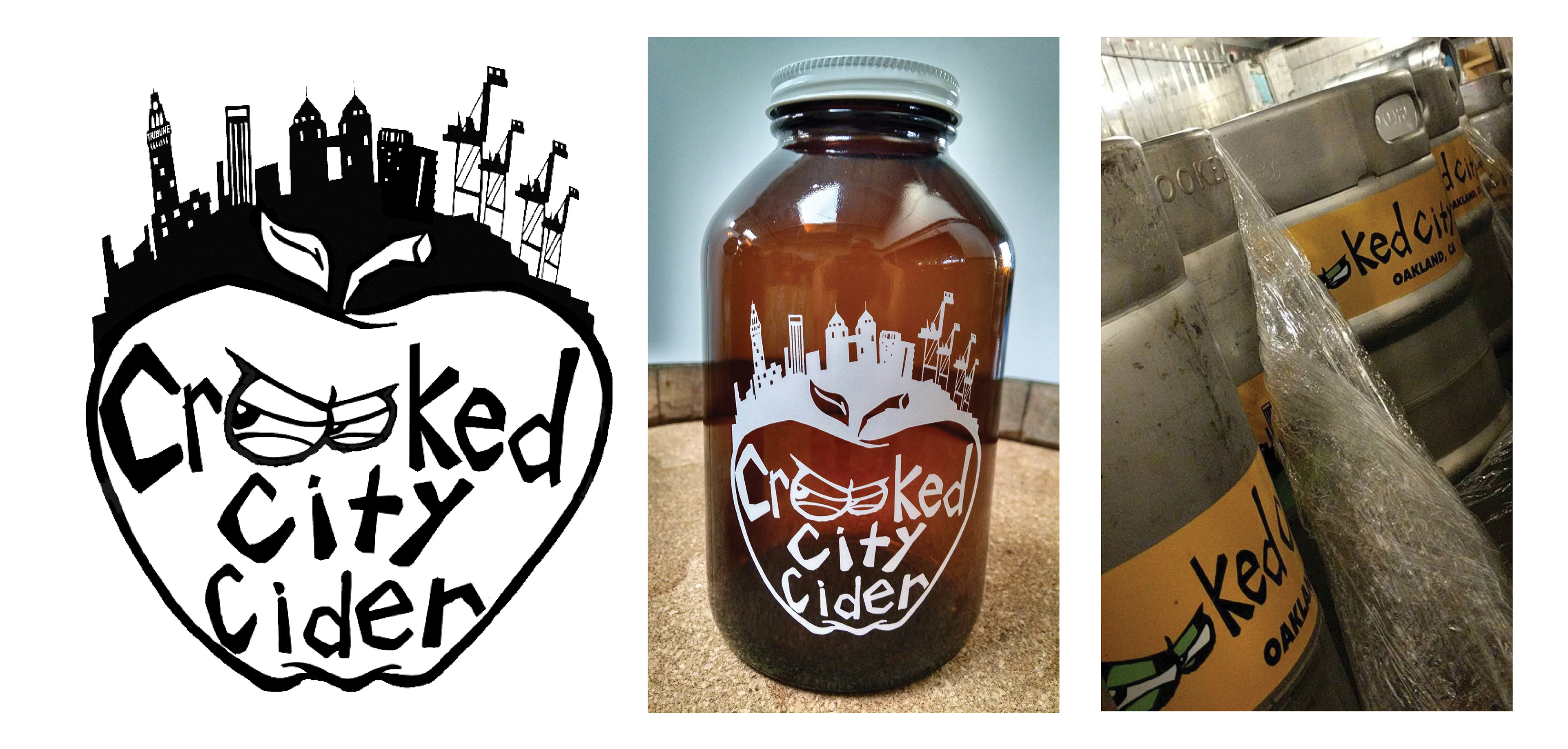
After coming up with a final piece, it was off to the races from there. I created different modifications of the logo with its color scheme and type in many variations, from keg labels to truck wraps.
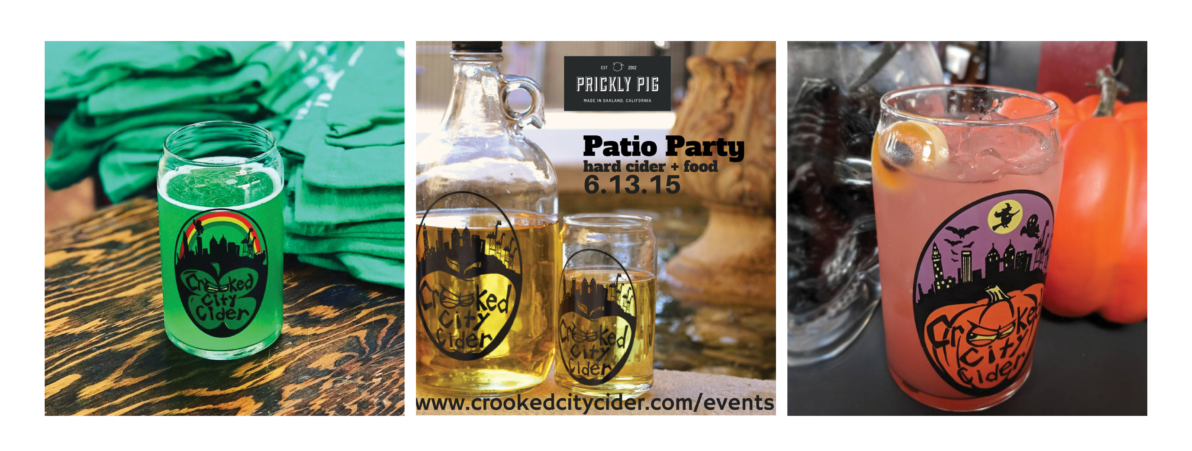
There are also a couple variations of the logo for certain holidays that may be associated with large amounts of drinking.
There are also a couple variations of the logo for certain holidays that may be associated with large amounts of drinking.
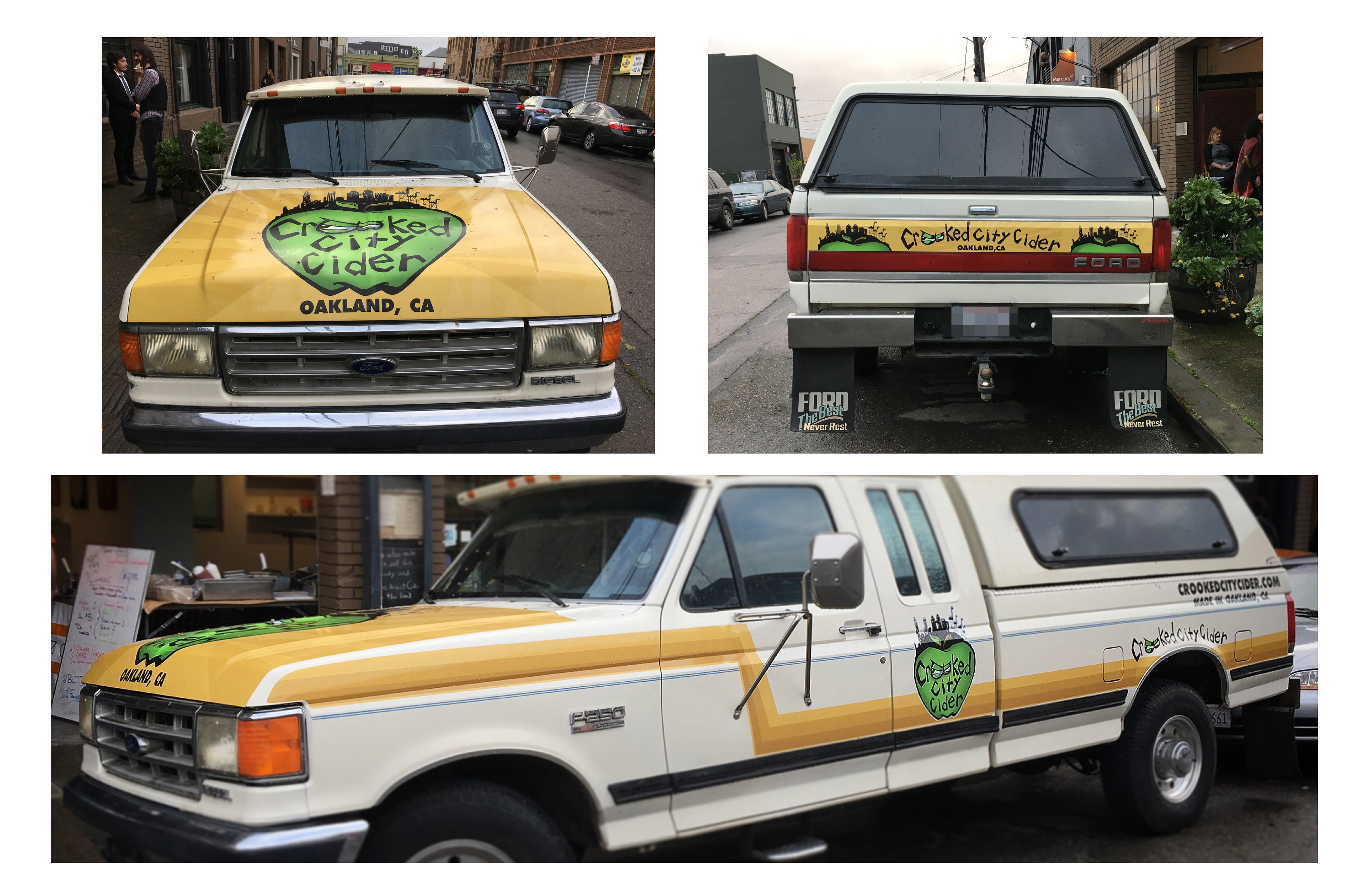
Truck-wrap design
Different variations of the logo
This is a body of work that continues to grow. Since 2014 I have created over 40 variations of different types of image formats in various file extentions for a wide variety of promo images, shirts, labels, etc.
It was a pleasure to work on a product that is local to me, as well as someones passion. And it tastes great too.
It was a pleasure to work on a product that is local to me, as well as someones passion. And it tastes great too.